Sunday, May 20, 2012

Tales From the Enchanted Forest, by Deborah Khora. Illustrated by Karen Hunziker.

aire Queen, from the Placerville Renaissance Fair. Photo by Stephan Dietrich. Thanks to Queen Elizabeth we have public schools today.

Before we get on to the business of self-publishing, allow me to introduce my own book, Tales From the Enchanted Forest. At the top right is the cover image to the book, and a glimpse of the interior can be viewed by clicking on the cover. This feature is courtesy of a program called Book Flipper Publisher. I'll be using material from my book to demonstate the process of formatting your book, and self-publishing. I'll discuss some of the books' history, and the history of children's literature as well. Here is the PDF for the introduction to the book- Folklore: An Introduction to History, Art & Literature. Although this book is primarily intended for ages 8-14, the introduction is scholarly material for parents, teachers and mature readers that may provide elementary education and inspiration to artists of any age. This is a book of old-fashioned fairy tales with regional art from the El Dorado County National Forest in Northern California, U.S.A. It was inspired in part by our local Renaissance Fair and it is fashioned around classical children's literature which emerged just after the medieval Dark Ages. This book contains witches and warlocks, as indeed these were features of Medieval times. The Renaissance period which followed the Dark Ages sought to eliminate these superstitions by way of education. I've wanted to write a book of children's fairy tales since I was a child. But it was not until I came to live in the El Dorado County National Forest and attended our local Renaissance Fair that I decided to pursue a formal education. Our community college places a special emphasis on the impact of the Renaissance on education. In addition to self-educating myself, my college courses uncovered some of the mysteries of children's literature. Were it not for these two factors, self-education and formal education, this book would never have been written. At this site we will go through the process of creating a children's book so that you, too, may create your own book, a children's book or otherwise. The Renaissance began in Europe during the 15th, 16th & 17th centuries. One of its major features was the conflict between the Catholic Church, which emphasized faith rather than education, and the Protestant Church, which emphasized education over illiteracy. During this time the printing press was invented and reading material was disseminated to the masses like never before in history. It was a time of great social change and social mobility for the underclasses as they gained skills in literacy. Here is a good link to a scholarly site on the history of children's literature at UCLA, and highly recommended reading: Fairy Tales and the Art of Subversion by Jack Zipes. One of Mr. Zipes theses is that children's literature began as a part of the European culture's civilizing processes: the European culture being a dominant culture.

Saturday, May 19, 2012

Formatting tips in MS Publisher 2010

Here is a link to a proposal I have written as an independent book formatting contractor. This document contains useful formatting tips. If you already have MS Publisher, or if you are willing to purchase it, I can set up your document for you for a fee, and send you the file. Set up is the most important part of formatting your book. If you are interested in a set-up plan, please e-mail dbdkho@aol.com.

Illuminated Manuscripts

Illuminated Manuscripts: "K is for King Lir" (not Shakespeare's King Lear), taken from Fairy Tale ABC's by the McLoughlin Brothers in the 1870's. This graphic is in the public domain because the copyright has expired. It is an 18th century variation of an "illumnated manuscript". Illuminated manuscripts were handwritten manuscripts with hand-painted or drawn illustrations. They were expensive to produce and prior to the development of the printing press, only the wealthy and the priests could afford these books. This graphic is an example of how the illiterate, adults and children alike, were taught to read. With the development of the internet, the publishing industry no longer has a monopoly on books and everyone with a story to tell can produce it on their own. Here is a link to one artist that creates illuminated letters. There are many other sites where they are in the public domain.
The infamous Art of War by Niccollo Machiavelli, author of The Prince, written for the ruling banking family, The Medici's in Florence, Italy. If anyone believed in the logic that the pen is mightier than the sword, Machiavelli did. His belief that deception is a legitimate war tactic has earned him a bad reputation amongst modern day readers. However, his books were never intended for publication amongst the masses but for the Medici's. Insofar as war strategy is concerned, he must be viewed as a realist, rather than an idealist. He was a political scientist of his day, and also a historian. On that note, an interesting bit of trivia is that his historical books do not contain footnotes as modern scholarly works require. His works were part of the Medici library, which later became the first Public Library in Italy. I'm sure researching the internet would yeild pleny of information on the topic of illuminated manuscripts, but one good site I found on the topic is here: http://freechristimages.org/illuminated_manuscripts.htm And on a lighter note for authors who know the history of the class wars and religious conflicts of the time period:

Friday, May 18, 2012

Self-publishing with Blurb.

First Edition at Blurb.com: The first version of my book was created at Blurb.com. You can download software from the site to create your book called Book Smart. When I downloaded the software a few years ago, it was free. I believe the price may now be $3.95, but it may still be free. Blurb provides TEMPLATES to create your book. There are some tutorials on the site that provide instructions for working with the templates. Since I last worked in Blurb, they have incorporated a Microsoft Word add-in feature. I am no longer selling my book at Blurb. I have added a lot of information to my book and the second version at Lulu.com is a much better version. Although Blurb does provide a verly lovely finished product, I would reccommend it for photography or picture books with small blocks of text rather than large segments of text combined with graphics. It's been a long time since I have used them and the program may be more user friendly than it was when I used them. I have included a video for them and a screen shot of the software as it was when I used it.

Here is a screen capture of the layout in Blurb. Use the zoom feature to enlarge your view.

Thursday, May 17, 2012

Formatting books, video.

Video, Deborah Khora: These two videos are the first videos I ever created. Some of the information in them overlaps, but combined they provide some foresight to help get you started on creating your own children's book.

Wednesday, May 16, 2012

Publisher 2010 Ribbon, Text Box.

This is not a picture of the entire legnth of the ribbon in MS Publisher 2010. I cut it off just after the insert text and insert picture tabs on the far right of the ribbon. To insert text on any page you must first draw a text box by clicking the draw text box tab. This feature works very similar to the cropping feature (cutting off material outside of a graphic, for instance) except in reverse- you will be given a small cursor in the shape of an plus sign, +, and you use it to draw a square on the interior of a blank page rather than cropping exterior matter on the outside of a page or picture. To insert a text box, click on the draw text box tab on the ribbon. Click on the location inside the page you want to draw the text box: for instance, if you wish to begin text at 4.5 inches down on the page, click in the blank page at 4.5 inches. Your cursor will become a plus + shape. Move the cursor across the page in the right direction, then move the cursor in the downward direction. Hit save. Next to the draw text box tab is the insert picture tab for inserting graphics. If you need to make a graphic smaller than the size you have inserted, right click on the graphic and you will see an option to "format picture". This will give you a menu and you choose the "size" tab. If you reduce the graphic by a few inches in width, the computer will automatically proportion the height if you make sure the box is clicked that says lock ratio proportion.

Minimizing trial and error in self-publishing.


Production- minimizing trial & error: Although I do intend to supplement this blog with some education on art history, for now we'll assume you do not need assistance with story ideas or artistic inspiration, and get right down to production tips and things to avoid. I won't be identifying every single step you must take, but will emphasize certain areas to focus on to minimize the trial and error experience you might have in this process. The first version I created of my book is at Blurb.com. They provide a very nice finished product from an exterior point of view. But I felt the interior, meaning the text managing and layout features, to be very difficult to work with. The overall end appearance of the interior seemed very "square," literally. When I used the program, there were no options for round or oval graphics. Since the time I published in Blurb, they have incorporated a MS Word feature that might make it easier to manage and edit text. But I've moved on to using Microsoft Publisher 2010 and Publishing a PDF file with Lulu.com. In the long run, I will simply bring my PDF file to a local or on-line short run printer and have them printed myself. The cost of printing my book with Blurb and Lulu ranges between $30-45 per book, depending on whether or not it is hardcover or softcover. But a short run print can cost $13.41 per book for 25 books, and even less to print per copy depending on how many books you print. Some on-line printers have minimum amounts, frequently 50 books minimum. I found one that will print a 25 book minimum- at www.book1one.com. Many of the on-line printers have calculators on their web-site so you can get a price quote on the spot. Just remember to distinguish between the amount of pages that will be printed in color, and the amount that will be printed in black only. Books without color are by far the least expensive to produce. Of course, you also have to factor in the cost of shipping- and it may be more cost effective to use a local printer if the shipping costs are going to raise the price per book too high. But let's not jump to the end before we begin. The least expensive on-line printer I have found so far is Createspace. I was also happy with the weight of the paper at Createspace. As Goldilocks would say, it was "just right." I found the paper weights with Blurb and Lulu to be too heavy for my style. Although I used MS Publisher 2010, technically you can use MS Word to create your manuscript. Both of these programs allow you to save your document in PDF format that you can upload to Lulu, or bring to a printer on your own. But at least one prolific self-publisher has commented that there can be some difficulty anchoring graphics in MS Word. I seem to recall there is a feature to "anchor" graphics in MS Word, and when the graphic is anchored there is a little ship anchor symbol. Try searching the help feature to learn how to anchor graphics. The main thing to remember if you use MS Word is that you must view your document in a two page spread. If you use Blurb, this strategy should be utilized also. As I have mentioned in my videos, every chapter or a new story begins on a right-hand page approximately 4.5 inches down from the top of the page. You'll be able to compare right and left pages in a two page spread. Sometimes, at the end of a chapter or a new story, the left hand page will be blank. 
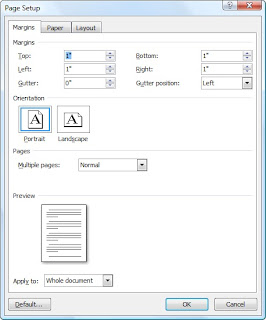
It is not a bad idea to imitate a simple book layout and format from a book on your book shelf! The front matter- title page, copyright page, and dedication pages usually do not have page numbers, although it may have Roman numerals. A Preface or Introduction generally has Roman numerals. The main body of text has regular numbers. Set your margins in the beginning, and don't forget to add a little extra to the gutter margin- the crease in the middle between pages. Here is a screen shot of the gutter margin menu in MS Word.
In general, printers, including Lulu print the book in batches of four pages. So, in the end the number of pages in the book must be divisible by four, and a good rule to follow is that the last page should be blank. Also, depending on the age of your audience, font size can make a difference in appearance. I'd recommend 11 pt. 12 pt might be better for very young readers. One of the benefits of printing with Lulu is that if you have a lot of illustrations, the cost of printing a trial copy (or two, or three) is the same price as the canisters of ink you might use on your home printer. At least that's the case with my ink. It costs me the same to print it at home or with Lulu, but by printing it with Lulu instead, I can see the entire finished product with front and back covers, bound, and make improvements with a better view of the end. It's also not a bad idea to search around for other publishing options with bookemon.com or flutterby.com. I have not used these programs but from what I've seen of them, they do bear some resemblance to Blurb, and on that note I can only offer an opinion that these type of template programs may be sufficient for small blocks of text, such as poetry, and more pictures or photographs to fill the book. But when it comes to large blocks of text, I can hardly recommend templates. With Microsoft Publisher you can design your document more according to your own vision, rather than one preset for you. One book that may be helpful in learning Microsoft Publisher 2010 is Using Microsoft Publisher 2010, which when purchased new includes online tutorial videos. The author is Brian Posey, and it can be purchased at Amazon.
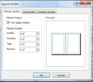
The screen capture to the left is setting custom margins in MS Publisher 2010. Margins are set under the Page Design tab on the ribbon, then click margins, and custom if it is a 6x9 custom document. Notice the margins on the inside between pages are larger than the outside margins. The inside margin is the gutter. The gutter margin set to slightly higher (.8) than the top, bottom and outside margins (.5). It's pretty important that the margins, including the gutter are set from the beginning. In a custom document, a margin has to be set for every single page.

Tuesday, May 15, 2012

Page numbering, MS Publisher 2010.


Page Numbering: The first basic step you must take in MS Publisher is to create a text box. There is a tab on the "ribbon" (formerly called a tool bar) that says "draw text box." This will give you a special cursor to create any sized text box anywhere on the page in a custom document. But what I am demonstrating here are page numbers, not text boxes. Notice to the far left in this screen shot you can see page numbers. However, these page numbers are not inserted into the document unless and until you 1) Hit the insert key at the top left in the ribbon. 2) Go to the page numbers tab at the far right upper corner of the ribbon and insert page numbers. In the example below you can see the page numbers to the far right that are not inserted into the document. The circles indicate where the insert tab & page number tabs are on the ribbon. Click on the screen shot to enlarge for better viewing. You will need to arrange your document in sections for front matter such as the Table of Contents (seen below) usually without page numbers, middle material, such as Introductions which generally contain Roman numerals, and the main body of text, which contains regular numbers. Creating sections is done by right clicking the mouse on the page you want to begin or end a section and you will be given a drop down menu.

Monday, May 14, 2012

Page numbers in sections, MS Publisher 2010.


Sections: Your page number format should be arranged in sections. In the screen shot below, in the window to the far left of the screen where all pages are displayed, you can see the sections separated from each other between pages 8-9 and 10-11 with a bar that has a small arrow on it. It's easier to see if you click on the screen shot and enlarge it. The way to create a section is to right click on the page you want to separate from another page and you will see a drop down menu that allows you to separate the pages either before the page you have selected, or after the page you have selected. This way, when you want no page numbers on a section, you can eliminate page numbers for that section only. If you establish your numbers to appear as Roman numerals, they will appear as Roman numerals for that section only, etc. That same right click menu will give you other options, such as inserting or deleting pages. Although the pages are numbered 1-9 for the front matter in this screen shot, in fact they do not appear in the printed book because the page numbers have not been inserted. Moreover, although the second section appears to begin with page 10, in the actual printed document it is a Roman numeral v, which is an option you have in the insert page numbers feature.

Sunday, May 13, 2012

Insert Graphics MS Publisher 2010.

Graphics: On the ribbon to the right of the draw text box tab is a little picture of two mountains and a sun, and this is the insert picture feature. Click on this tab to insert graphics. I have to assume this is not the first time you have done this sort of thing and that you already have some basic computer knowledge. The point I am demonstrating here is the rulers. By holding down the shift key + left click on the mouse, you can drag the rulers from top and bottom so that you can measure to the sixteenth of an inch the graphic in relation to the surrounding margins. It gets easier with a little practice. All the graphics should be the same measurement from the edges of the margins consistently throughout the book. A custom document does not automatically center anything for you! There may be some minor variations here and there on the exact size of the graphic depending on your skill level in inserting the graphic and formatting it, but by and large the insert graphic and format feature will do most of the math for you. I don't think you'll be able to escape from math completely though! There is also a captions feature, and numerous other features you can use to enhance your graphics, some of which we'll discuss further on, including shapes and borders. But if you want to get a head start, look at the ribbon and experiment a bit.

Saturday, May 12, 2012

Self-publishing with Createspace.

Good News! Createspace.com, an Amazon company, is by far the least expensive Print On Demand company that I found after many hours of reasearch. They can be found at this address: https://www.createspace.com or the above link. I felt very confident that Createspace did all they could to make the process easier for the author. They have their own upload, and it is not necessary to use an FTP to transfer a large file. They have an excellent digital editor that allows you to flip through the pages of the book in a two page spread. The cost of producing my book has decreased almost three times less than the original amount it cost to produce. There is a calculator on the site to enter in the number of pages to your book and get an estimate. I'll provide more details soon. I'm still convinced that short-run printing is the best option, but now I can sell my book for $22 a copy. Below is a screen capture of the digital editor in Createspace. I was very impressed asnd wished I'd hd such a proof-reader from the very beginning of this project. Instead I ordered several copies of my rough drafts/prototypes in hard copy so I could compare the physical book with my computer screen. It can be very difficult to have a correct over-view of your book when some programs only offer you thumbnails of the "big picture." In this instance Createspace is alerting me to the fact that this graphic has to low of a dpi.

Friday, May 11, 2012

Wednesday, May 9, 2012

A good source of research material but- buyer beware.Writingworld.com A wealth of information at this site, but be aware of competitors leading you in the direction they want you to go. I find that the main source of competition between online self-publishing companies are companies who want to FORMAT your book for you (and dissuade you from learning these skills yourself)and on-line printing companies who can produce inexpensively as long as you can format your own book and cover. There is no question that even with basic or intermediary computer skills, formatting your book can be very difficult and frustrating. It gets tiresome reading your own book over and over again. But with some precautionary measures, you can reduce your frustration. Some of the most important facts to begin with up front: 1.) Set your margins and gutters at the beginning.In a custom document, a 6x9 in Publisher, every single page must have the margins and gutters set individually. 2) Always view your document in a two page spread, even in MS Word. The beginnings of chapters or stories starts on a right hand page about midway down the page (4.5 inches). 3) In MS Publisher, you have to create a text box before you can insert text. This is fairly simple- there is a "draw text box" button on the ribbon. 4.) Make sure the correct font size is set from the beginning! Depending on your age group, 11 pt is about average for a text book with some illustrations. Fonts of 12 and higher are pretty elementary- the younger the reader, the higher the font size generally. 5) Use the rulers feature in MS Publisher to measure your text boxes and graphics so they are evenly centered on the page. 6) Learn how to create "sections" in Publisher to divide the book accordint to the front matter, which frequently does not have page numbers, the forword and introduction, which frequently have Roman numerals, and the main body of text, which has regular numbers. 7)Most on-line printers print in batches of four page sections, so your total page count must be divisible by four. 8)The graphics must be 300 dpi or higher, inserted into your document as JPEG or GIF, and then converted into PDF format which will be done automatically when you save your final document as a PDF. It is not at all unusual to take one of your favorite books off the bookshelf and imitate the formatting- how many blank pages up front, how many title pages, where the copyright page goes, etc. And, as I have mentioned before, creating a cover is not that difficult with a MS Publisher 2010 catalog template, and I'll discuss creating your cover soon.